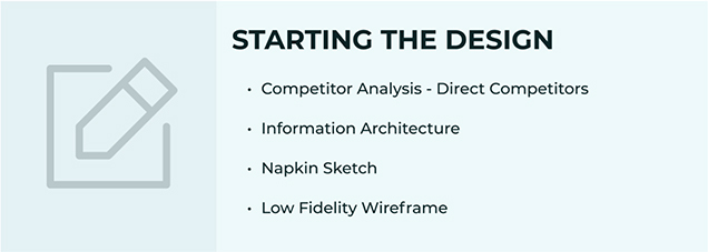
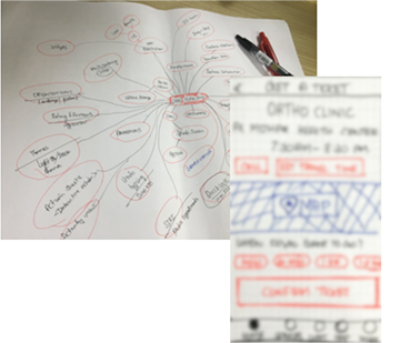
Wire-framing, prototyping, Usability testing
UX Designer
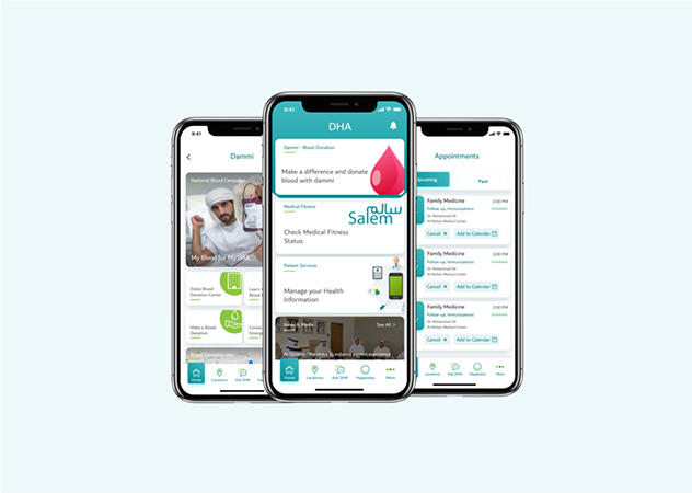
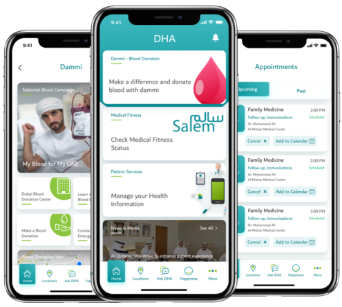
The smart app facilitates all health care needs for the people of Dubai.
It helps people and Health care professionals to seamlessly access and manage all healthcare-related services through the mobile app.
Must be No:1 among government services
Keeping track of multiple apps for health care services
The mobile user interface was confusing and Not user-friendly
Feels very unclear to find a specific piece of information
The information is not personalized. Lots of information on the dashboard was not useful to the user
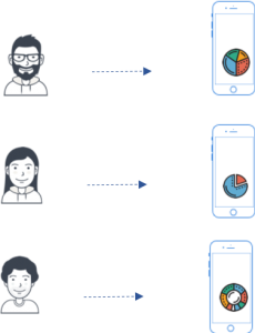
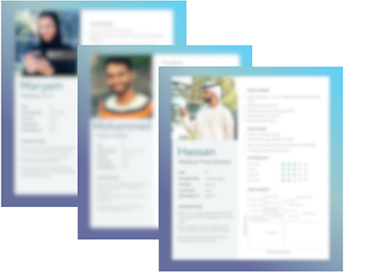
Bakitha is a home maker ,taking care of 3 kids at home, she needs a one stop heathcare application to manage family health because to see all information at one place
| Challenges Faced | How did I approach? |
|---|---|
| Design Process Implementation 1.Team unaware of bad design & design process, eventually requesting for unrealistic timelines |
1.Created awareness by Conducting Workshop on UCD, Design thinking implementation, and its importance. |
| Stakeholders influencing design 2.Requesting multiple design options. |
2.More design options are cause for more confusion. Come up with multiple options during the prototyping phase but present three designs with the designer’s recommendations. |
| 3.Stakeholders influence design by giving their design inputs/advice based on their app usage and past experience. | 3.Inputs/Suggestions are taken from all stakeholders by conducting participatory design sessions but from a designer’s perspective. Design justification is given for the proposed designs based on best practices and valuable inputs from the end-users. |
| 4.Developers denying developing some usability elements due to UX gains ignorance(Ex: Micro interaction). | 4.Design justification and importance are given for every single usability element with their UX gains. |
| 5.Request for jazzy colors and animations. | 5.Stick to brand guidelines and accessibility guidelines and briefing impact on the violation. |
| 6.Many features = Good User experience. | 6.Recommended (MVP)Minimum Viable product approach rather than implementing all envisioned features which is really needed or not. |
| Innovation Limitations 7.Health care App functionalities are inherited and consume data provided by the legacy mother application with limited functionalities with fewer chances to innovate. |
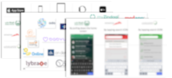
7.Providing detailed document on the importance of best practices and technologies adopted by the peers/Competitors by conducting competitor analysis and secondary market research. |
| 8.Supporting applications are often unused due to management constraints which impacts the experience. | 8.Analyzed and documented the impact of the design and end-user experience. |
| Stakeholders Ownership 9.Application owners are hesitant to adopt one app approach since fear that a new app will make their app functionalities less important comparatively. |
9.Personalized dashboard based on the persona and their task priorities and Anticipating user action using predictive analysis and the prompt user with action items rather than static. |
| 10.Expecting the same features/functionality existed in the old app. | 10.Eliminating redundant features/functionality, grouping similar functionalities by optimizing existing task flows. |
| User Needs/Pain points | Before | Now |
|---|---|---|
| 1. Multiple Applications for health care services Keeping track of multiple apps for health care services. The information is not personalized. a lot of information on the dashboard which the user never needs. |
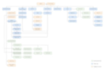
Multiple Apps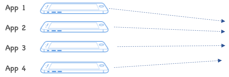
1.Multiple apps with multiple Dashboard and static content. 2.Redundant Functions 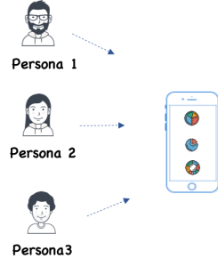 |
Single App approach
|
| 2.Applications not user friendly Feels very unclear to find certain piece of information And Outdated look and feel. |
Poor Information Architecture 1.Cluttered Information. 2.Basic Search functionality. Aesthetic 3.Over usage of color eventually creates visual noise. Reachability 4.Placement of Primary & Secondary features/functionalities UI is not based on priorities and importance. Guidelines 5.Inconsistent UI elements not following IOS & android guidelines. 6.Not following smart government guidelines. Help documentation /Features Familiarity 7.Lack of help features to guide the user through the apps. Flexibility and efficiency of use 8.Lack of feedback on the user’s action. 9.Lengthy steps to complete tasks and reach services. |
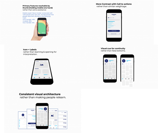
1.Well structured and organized information Visual hierarchy with 8X vertical rhythm and white space. 2.Intuitive Global Search. 3.Aesthetic and minimalistic primary and secondary colors usage Sticking to branding guidelines. 4.Primary features are placed within the reach of thumb for easy access. 5.Adhered to IOS & android guidelines for native experience. 6.Enforced smart government guidelines in application. 7.Rolled out contextual Coach mark/user on boarding to caters both technologically adaptive and non adaptive users. 8.Enhanced feedback and Visibility of system status which speaks user language. 9.Optimized the UI for faster completion of tasks and Service available in minimal taps. |